Created to suit the needs of bloggers back in the day, WordPress is now capable…

10 Basic Tips About Responsive Design
Responsive Design is a set of modern tools and techniques aiming to rearrange the way information is displayed depending on the device capacities.
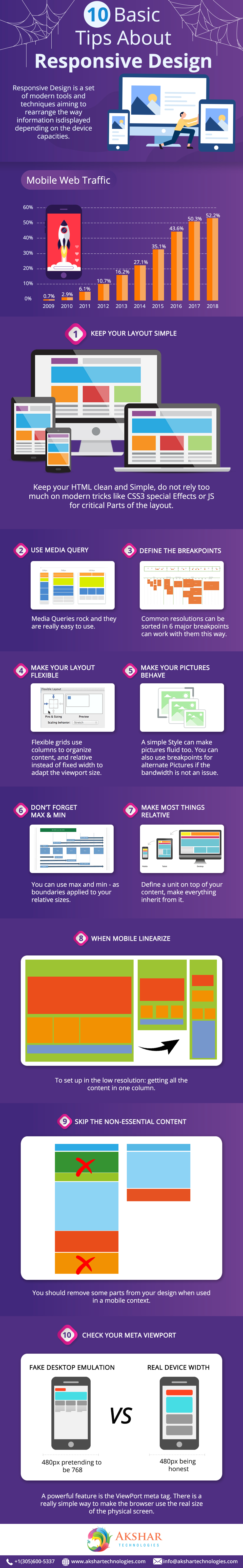
1. Keep your Layout Simple
Keep your HTML clean and Simple, do not rely too much on modern tricks like CSS3 special Effects or JS for critical Parts of the layout.
2. Use Media Query
Media Queries rock, and they are really easy to use.
3.Define The BreakPoints
Common resolutions can be sorted in 6 major breakpoints can work with them this way.
4. Make Your Layout Flexible
Flexible grids use columns to organize content, and relative instead of fixed width to adapt the viewport size.
5. Make Your Pictures Behave
A simple Style can make pictures fluid too. You can also use breakpoints for alternate Pictures if the bandwidth is not an issue.
6. Don’t Forget Max & Min
You can use max and min – as boundaries applied to your relative sizes.
7. Make Most Things Relative
define a unit on top of your content, make everything inherit from it.
8. When Mobile LineARize
To set up in the low resolution: getting all the content in one column.
9. Skip the non Essential Content
You should remove some parts from your design when used in a mobile context.
10. Check your Meta ViewPort
A powerful feature is the ViewPort meta tag. There is a really simple way to make the browser use the real size of the physical screen.
Related Posts